This forum is for discussion about anything else.
lalaladucks
lalaladucks
a study in thread
lalaladucks
a study in thread a study in thread
Posts: 4082Joined: February 25, 2015
Post #0 ISO ) » Mon Mar 26, 2018 5:53 pm
Post by lalaladucks Mon Mar 26, 2018 5:53 pm
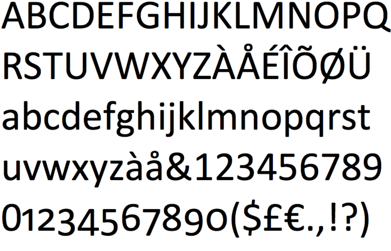
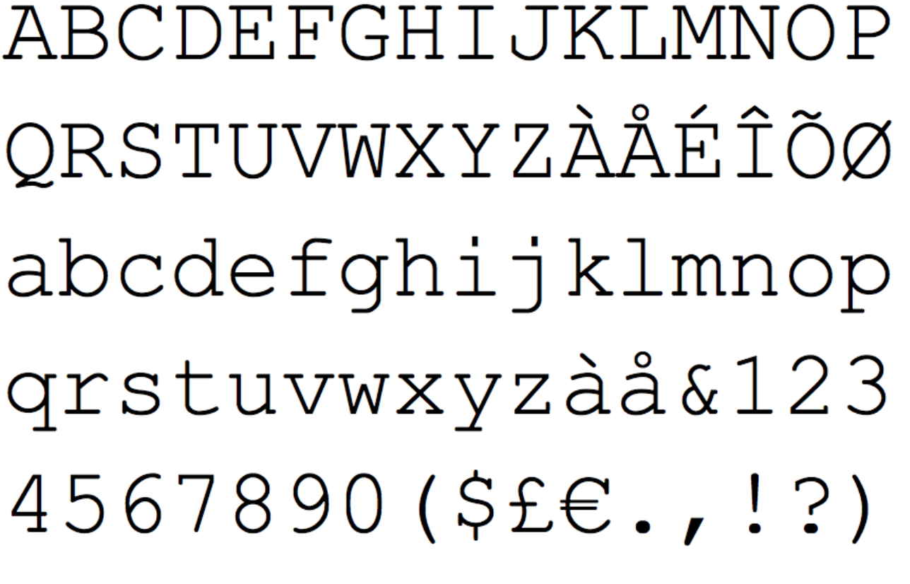
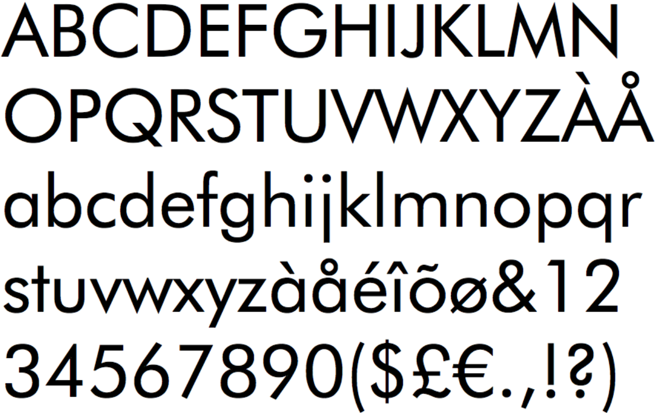
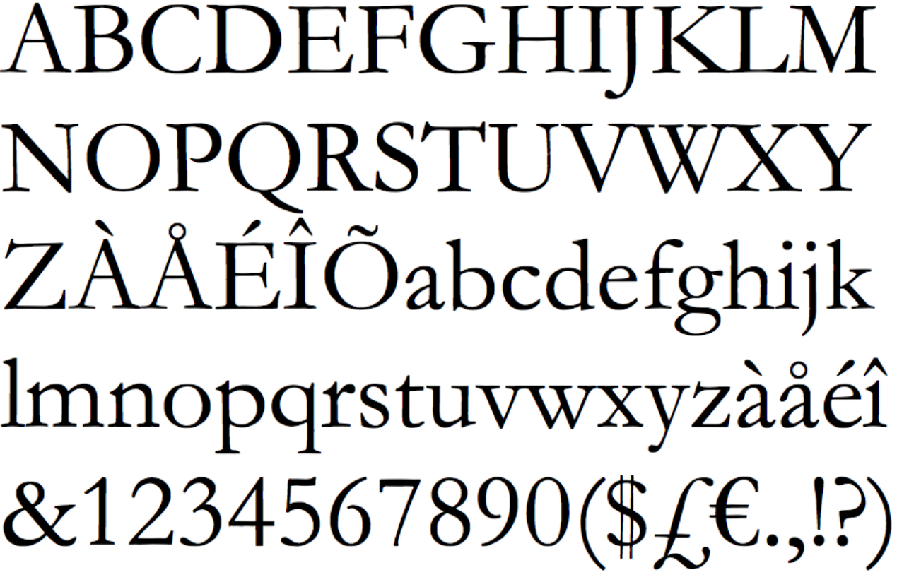
for research. let me know in the replies if the list missed the best font!
GreenLiquid
GreenLiquid
Mafia Scum
GreenLiquid
Mafia Scum Mafia Scum
Posts: 1054Joined: July 15, 2005
Post #1 ISO ) » Mon Mar 26, 2018 5:54 pm
Post by GreenLiquid Mon Mar 26, 2018 5:54 pm
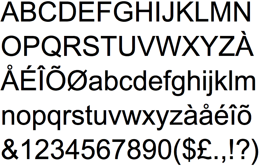
Where the heck is Helvetica?
Avatar courtesy of Chickadee! |
GTKAL
Katsuki
Katsuki
Cupcake
Katsuki
Cupcake Cupcake
Posts: 14872Joined: April 26, 2010Location: In your head~
Post #2 ISO ) » Mon Mar 26, 2018 6:22 pm
Post by Katsuki Mon Mar 26, 2018 6:22 pm
What does comic sans look like?
Fluffy fluffy~~~ |
"READING KATSUKI IS LIKE SOME SORT OF POSTMODERN ARTFORM"
- GreyICE
Katsuki is by far more absurdly beautiful than Fate.
(hai parama)
Katsuki's Madness coming to you shortly: Nov, 2011!
lalaladucks
lalaladucks
a study in thread
lalaladucks
a study in thread a study in thread
Posts: 4082Joined: February 25, 2015
Post #3 ISO ) » Mon Mar 26, 2018 6:24 pm
Post by lalaladucks Mon Mar 26, 2018 6:24 pm
your face
Raskolnikov
Raskolnikov
Jack of All Trades
Raskolnikov
Jack of All Trades Jack of All Trades
Posts: 6395Joined: November 15, 2015
Post #4 ISO ) » Mon Mar 26, 2018 6:26 pm
Post by Raskolnikov Mon Mar 26, 2018 6:26 pm
Of these, maybe futura
ma
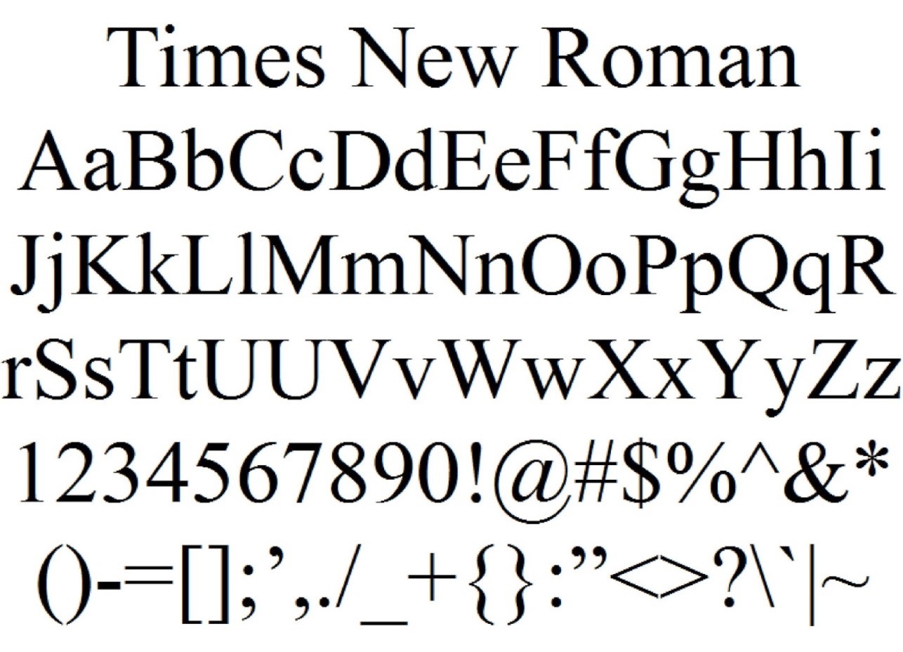
or gothic. Too many bad memories from times new roman.
GreenLiquid
GreenLiquid
Mafia Scum
GreenLiquid
Mafia Scum Mafia Scum
Posts: 1054Joined: July 15, 2005
Post #5 ISO ) » Mon Mar 26, 2018 6:26 pm
Post by GreenLiquid Mon Mar 26, 2018 6:26 pm
Comic Sans is the xyzzy of this poll.
Avatar courtesy of Chickadee! |
GTKAL
Katyusha
Katyusha
Mafia Scum
Katyusha
Mafia Scum Mafia Scum
Posts: 3878Joined: November 7, 2017
Post #6 ISO ) » Mon Mar 26, 2018 7:42 pm
Post by Katyusha Mon Mar 26, 2018 7:42 pm
GreenLiquid wrote: Comic Sans is the xyzzy of this poll.
Literally came into the thread to post both of these gj u r valid
eddie cane
Katyusha
Katyusha
Mafia Scum
Katyusha
Mafia Scum Mafia Scum
Posts: 3878Joined: November 7, 2017
Post #7 ISO ) » Mon Mar 26, 2018 7:43 pm
Post by Katyusha Mon Mar 26, 2018 7:43 pm
Oh and also if u like arial u r an objectively bad person I hope u enjoy ur shitty retrace of mfuckjng Helvetica
eddie cane
McMenno
McMenno they/them
One For Aren't-We-All
McMenno they/them
One For Aren't-We-All One For Aren't-We-All
Posts: 5159Joined: February 18, 2015Pronoun: they/themLocation: In spaaaace
Post #8 ISO ) » Mon Mar 26, 2018 8:28 pm
Post by McMenno Mon Mar 26, 2018 8:28 pm
Wingdings
Cheery Dog
Cheery Dog
Kayak
Cheery Dog
Kayak Kayak
Posts: 8038Joined: June 30, 2012Location: OMG BALL!
Post #9 ISO ) » Mon Mar 26, 2018 9:40 pm
Post by Cheery Dog Mon Mar 26, 2018 9:40 pm
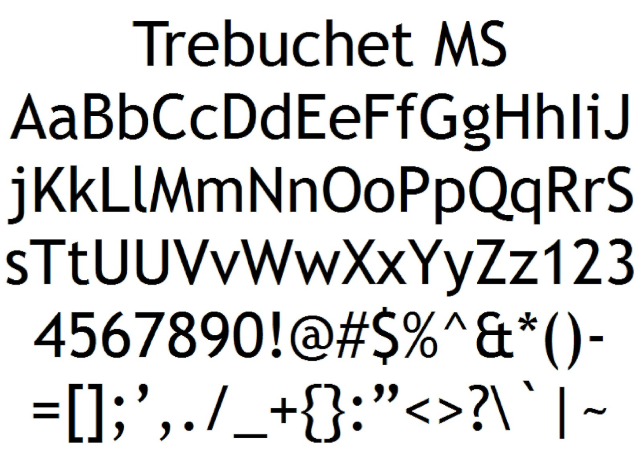
I can't compare these fonts when Century Gothic, Times New Roman and Trebuchet are showing me different symbols and order than the rest
Holder of the Longest Continuous Weekly Mafiascum Post Record. 1 July 2012 - 16 Feb 2023
Korts
Korts
Luddite
Korts
Luddite Luddite
Posts: 5752Joined: January 1, 2008Location: HUN BUD
Post #10 ISO ) » Mon Mar 26, 2018 9:58 pm
Post by Korts Mon Mar 26, 2018 9:58 pm
Lots of missing options.
scumchat never die
Korts
Korts
Luddite
Korts
Luddite Luddite
Posts: 5752Joined: January 1, 2008Location: HUN BUD
Post #11 ISO ) » Mon Mar 26, 2018 10:00 pm
Post by Korts Mon Mar 26, 2018 10:00 pm
And if we're talking xyzzy options, let's not forget Comic Papyrus.
scumchat never die
Korts
Korts
Luddite
Korts
Luddite Luddite
Posts: 5752Joined: January 1, 2008Location: HUN BUD
Post #12 ISO ) » Mon Mar 26, 2018 10:01 pm
Post by Korts Mon Mar 26, 2018 10:01 pm
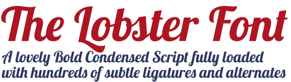
Lobster is also quite pretty.
scumchat never die
shaft.ed
shaft.ed
dem.agogue
shaft.ed
dem.agogue dem.agogue
Posts: 4998Joined: August 15, 2007Location: St. Louis
Post #13 ISO ) » Tue Mar 27, 2018 3:12 am
Post by shaft.ed Tue Mar 27, 2018 3:12 am
Helvetica and Arial are pretty much indistinguishable
most Science journals ask for typeface in figures to be in Helvetica, but I just use Arial because my Illustrator doesn't have Helvetica. Nobody has noticed...yet
EDIT: also anyone not voting Arial is my new mortal enemy
Korts
Korts
Luddite
Korts
Luddite Luddite
Posts: 5752Joined: January 1, 2008Location: HUN BUD
Post #14 ISO ) » Tue Mar 27, 2018 4:10 am
Post by Korts Tue Mar 27, 2018 4:10 am
Assuming you're the single vote on Arial, everyone is now your mortal enemy.
scumchat never die
Randomnamechange
Randomnamechange
Jack of All Trades
Randomnamechange
Jack of All Trades Jack of All Trades
Posts: 6075Joined: February 8, 2014
Post #15 ISO ) » Tue Mar 27, 2018 4:35 am
Post by Randomnamechange Tue Mar 27, 2018 4:35 am
where is my boi jokerman
vonflare (21:40)
hiplop
hiplop
Jury Darling
hiplop
Jury Darling Jury Darling
Posts: 12498Joined: March 23, 2011Location: full of self
Post #16 ISO ) » Tue Mar 27, 2018 5:38 am
Post by hiplop Tue Mar 27, 2018 5:38 am
arial hurts my eyes
third best scummer of all time
shaft.ed
shaft.ed
dem.agogue
shaft.ed
dem.agogue dem.agogue
Posts: 4998Joined: August 15, 2007Location: St. Louis
Post #17 ISO ) » Tue Mar 27, 2018 6:21 am
Post by shaft.ed Tue Mar 27, 2018 6:21 am
In post 14 , Korts wrote: Assuming you're the single vote on Arial, everyone is now your mortal enemy.
#hillworthdyingon
Equinox
Equinox he/they
Shot Count
Equinox he/they
Shot Count Shot Count
Posts: 10105Joined: April 12, 2010Pronoun: he/theyLocation: Los Angeles, CA
Post #18 ISO ) » Tue Mar 27, 2018 3:11 pm
Post by Equinox Tue Mar 27, 2018 3:11 pm
The only correct answer: COMIC SAAAAAAANS!
the worst
the worst
Snuggly Duckling
the worst
Snuggly Duckling Snuggly Duckling
Posts: 36849Joined: November 7, 2015Location: pond
Post #19 ISO ) » Thu Mar 29, 2018 12:43 am
Post by the worst Thu Mar 29, 2018 12:43 am
Annadog40
Annadog40
Owl of the Night Chat
Annadog40
Owl of the Night Chat Owl of the Night Chat
Posts: 786Joined: May 2, 2015Location: Arendelle
Post #20 ISO ) » Thu Mar 29, 2018 12:57 am
Post by Annadog40 Thu Mar 29, 2018 12:57 am
Comic sans is best. It is both fun and legible.
This is my life now
Once you have 100 posts, click
here to go to the page to join the speakeasy group.
Brandi
Brandi
Awwwrtist
Brandi
Awwwrtist Awwwrtist
Posts: 2426Joined: May 4, 2008
Post #21 ISO ) » Thu Mar 29, 2018 4:28 pm
Post by Brandi Thu Mar 29, 2018 4:28 pm
comic sans!
drealmerz7
drealmerz7
Survivor
drealmerz7
Survivor Survivor
Posts: 15374Joined: February 9, 2016Location: earth
Post #22 ISO ) » Fri Mar 30, 2018 6:41 pm
Post by drealmerz7 Fri Mar 30, 2018 6:41 pm
wingdings
oh hey look!
WEE!
balance among all things
Pine
Pine
In Your Head
Pine
In Your Head In Your Head
Posts: 16763Joined: February 27, 2011Location: Upstate New York
Post #23 ISO ) » Tue Dec 17, 2019 5:45 am
Post by Pine Tue Dec 17, 2019 5:45 am
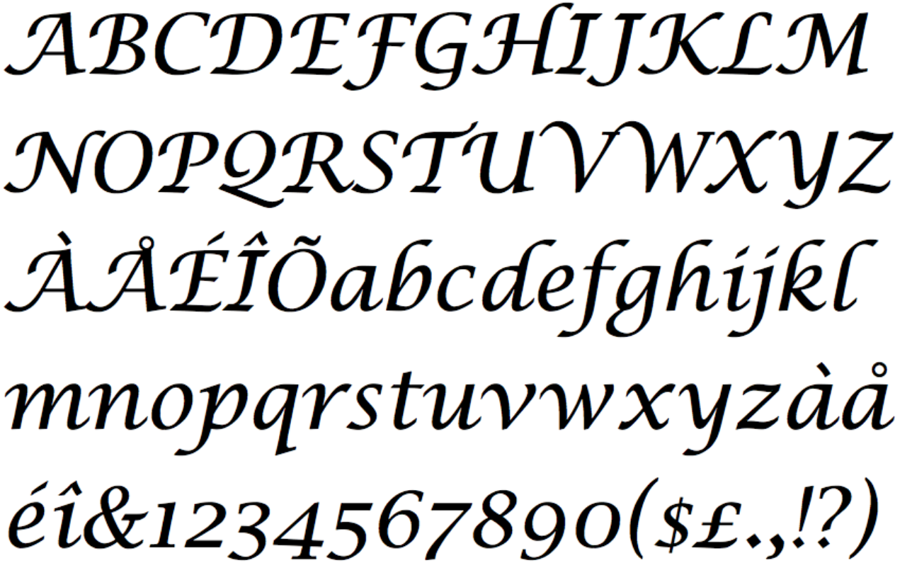
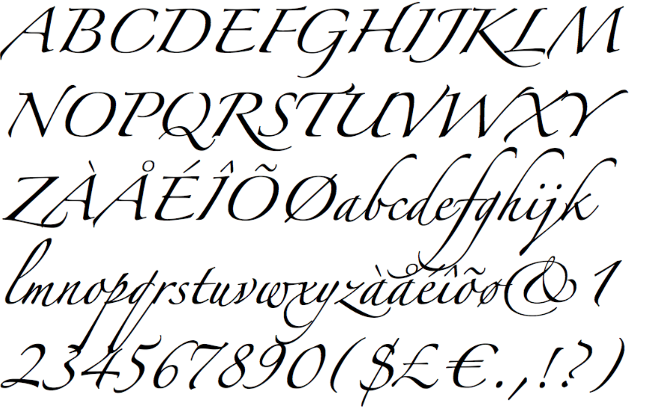
Voted for Zapfino, as I find it the most appealing of the choices given. My actual favorite is Exocet. I love how heavy and gothic it feels, and it is pleasing to the eye (mine at least).
"Cry havoc, and let slip the wombat of war!"
Act 3, Scene 1 of
Julius Caesar
, by W. Shakespeare
bugspray
bugspray They/Them
Mafia Scum
bugspray They/Them
Mafia Scum Mafia Scum
Posts: 3960Joined: March 19, 2019Pronoun: They/ThemLocation: somewhere else
Post #24 ISO ) » Thu Dec 19, 2019 2:16 am
Post by bugspray Thu Dec 19, 2019 2:16 am
a sans serif monospace typeface with just enough kerning so that bolded characters don't push each other to the side in around 16pt is The Best
Copyright © MafiaScum. All rights reserved.